  [,1] [,2]
a    1    1
b    7    2
c    9   -3
d 12 3Curve Fitting
R Programming
mathematics
This post is kind of a follow-up to the second Fun with R functions post, but not directly related. I was going through a few pracma functions when I ran across the polyfit() function for curve fitting. A bunch of years ago, I worked up a small program for the Casio Prizm calculator for curve fitting, and thought it would be fun to do a similar thing for R Programming. The Casio Prizm has a really nice program called “Picture Plot” where a curve could be plotted by outlining a feature in a picture, giving the values for duplicating that curve. This has many applications in the real world, such as architecture, mathemtics and electronics, just to name a few.
So, let’s get to it. And, oh by the way, I am just a casual dabbler in R, and nowhere near where a professional would be. I just enjoy it!
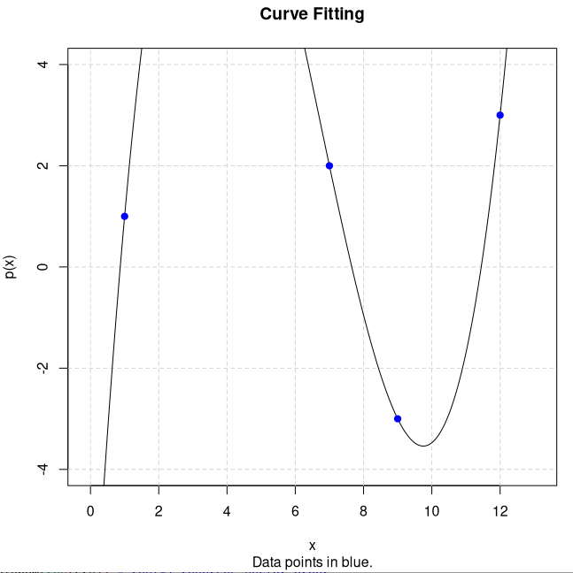
Curve fitting is taking a set of ‘x,y’ points and converting them into a quadratic formula to create a parabola that passes through all defined points.
For example, given the ‘x,y’ point set: a = [1,1], b = [7,2], c = [9,-3], d = [12,3], we create a quadratic formula that fits the ‘x,y’ points. There are four unknowns, so the quadratic formula would be: \(y = ax^3 + bx^2 + cx + d\).
First step is to convert the above point sets into a set of simultaneous equations by plugging in the ‘x’ values on left and ‘y’ value on right of ‘=’ sign. These values go into a augmented matrix (4 rows x 5 columns in this example):
\[\begin{bmatrix}1& 1\\7&2\\9&-3\\ 12&3\end{bmatrix} \Rightarrow\] \[\begin{align} a(1)^3 + b(1)^2 + c(1) + d = 1\\ a(7)^3 + b(7)^2 + c(7) + d = 2\\ a(9)^3 + b(9)^2 + c(9) + d = -3\\ a(12)^3 + b(12)^2 + c(12) + d = 3\end{align}\] \[\begin{align} 1 + 1 + 1 + 1 =1\\ 343 + 49 + 7 + 1 = 2\\ 729 + 81 + 9 + 1 = -3\\ 1728 + 144 + 12 + 1 = 3\end{align}\] \[\begin{bmatrix} 1& 1& 1& 1& |& 1\\ 343& 49& 7& 1& |& 2\\ 729& 81& 9& 1& |& -3\\ 1728& 144& 12& 1& |& 3\end{bmatrix}\]Working these simultaneous equations in a matrix using the ‘reduced row echelon form’ gives the ‘abcd’ values of: 0.1121, -2.2394, 11.6909, -8.5636, and assembling the pieces gives the formula: \(y = 0.1121x^3 - 2.2393x^2 + 11.6909x - 8.5636\), which yields a parabola that passes through the above ‘x,y’ points.
Now, if we wished to create that in R, we could ask for \(x ,y\) data point pairs as inputs to the script. In this case, we have already entered them.
Several functions I am using are matlib::echelon() and PolynomF::polynom, the first to convert the augmented matrix and derive the values for the quadratic equation, the second to determine the curve-fitted values for plotting. I am going to drop in a bunch of snippets. All these could be done differently, but I wanted to separate them for clarity. If I did this as input, I would first ask for the number of unknowns, then for entry of data pairs (x,y). I could then determine the number of rows/pairs and create a matrix of appropriate size for calculation and storage, depending on the polynomial degree (\(x^{unknowns - 1}\)).
Then, to populate the matrix with the formula results, I could use for() and while) loops, like this for example, where unk is the number of unknowns,
d <- unk-1
for(i in 1:unk) { # multiply values and populate matrix
    while(d>=1) { # do each row by columns
        mat[i,unk-d] <- e[i,1]^d
        d <- d-1 # next lesser degree
    }
    d <- unk-1 # reset power/degree
}
mat[,unk] <- 1 # add last column of 1's
This matrix is then added to the vector of y values for the augmented matrix. After rref, the values from the last column are fed into the polynom() function. The polynom() function requires the values to be reversed from the normal quadratic order. So, the rev() function does that very easily. To get something useful for plotting, we can do this,
p <- PolynomF::polynom(rev(crv)) # rev(x) reverses vector order
plot(p,xlim=c(minX,maxX),ylim=c(minY,maxY), main="Curve Fitting", \
  sub="Data points in blue.") # plot curve
points(e[,1],e[,2],col='blue',pch=19) # plot data points
This will give us a very nice diagram for display. I set the x/y limits to zoom in on the data points here.
Leaving out the xlim,ylim in the above plot() would show the entire waveform. And that’s about all for this post.
Have a great day, and may the Lord watch over you and yours!